


Candlestick patterns - when they generate reliable signals

Candlestick charts are the most popular form of price presentation given instrument on the market. "Claws of Japanese Technical Analysis", as Steve Nison charts, they were not known in Europe until practically 1990. Currently they are known and liked by most investors due to the simplicity of analysis and the multitude of information that we can read from them. In this article you will learn not only the basics of candle charts, but also the ability to analyze them in such a way as to read only reliable signals.
What shows the popularity of Japanese charts
It is hard to meet a trader who has never heard of candles on the chart, or one who has never used this form of analysis. Let's start with the fact that candlestick charts are easy to understand. Their simplicity is appreciated not only by experienced analysts, but also by beginners. The big advantage of analyzing this form of presenting the price of the instrument is the leading signals regarding potential returns on the market. Candles often generate (through formations) trend reversal signals faster than traditional, classic bar charts. We can use them to optimize exits and entrances to the market.
Candlestick charts provide much more accurate information on the direction of price changes. Specialists in their analysis are able to easily determine the strength of a given movement. Thanks to this, analysts and traders can not only increase the efficiency of their analyzes and optimize the strategy, but also increase the effectiveness of the techniques used. Candlestick charts are friendly when combined with other technical analysis tools.
Technical analysis and candlestick formations
"There is nothing worse than a rational investment policy in an irrational world. "
These are the words of John Maynard Keynes, which Nison included in his book confirming that technical analysis is not only a graph showing the current valuation of a given instrument by the market, but also the impact of emotions. Therefore, one could say that technical analysis (including the analysis of the price chart itself, without indicators and oscillators) helps to some extent measure the irrational factor (psychological / emotional ”).
Technical analysis in connection with the above, contains several "irrational" elements that shape supply or demand on the market.
Indicators, oscillators and candlestick patterns ...
According to the Japanese, the essence of price movement research is the candle body. There are a whole bunch of formations that they create. A few of them and basic terminology we described in TYM article. Now, however, we will focus on how to effectively combine candle analysis and the systems they create with the basic indicators and oscillators of technical analysis. Generally, one could say that the world can be used for almost any type of analysis, which would not be a lie. However, in the examples given below, I care about showing the simplicity of the signal generated by candles compared to other types of charts.
We will take a closer look at the classic EMA / SMA average. It is a very popular combination mainly used to catch trends in the medium / long term. We usually use 3-4 different EMA / SMA to form a web. This makes it easy to assess the strength of a given move.
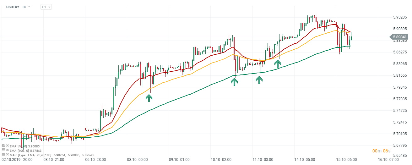
Candlestick chart and moving average EMA. USD / TRY chart, H1 interval. Source: xNUMX XTB xStation
In the places marked on the graph you can see where the wicks indicate a kind of "pulling" of the supply / demand movement from a specific average. You can therefore determine the increase in the likelihood of a continuation or reversal of a given move. The strategies based on them are relatively simple. They assume an exit / entry at the intersection of all or most of the averages. The greater the spread between them, the stronger the movement. Confirmations of the continuation of the trend can be found in wicks (more often) or candle bodies.
In the chart below we have EMA in settings (20,40,100), which I often use in my analyzes. The places marked with a green arrow show a kind of confirmation of the upward movement. The price decreased in many places creating low, while it was pulled up by the bulls, thanks to which we created a large wick on 40 and 100 periodic average.
Let's consider an extremely different line chart of the same instrument.
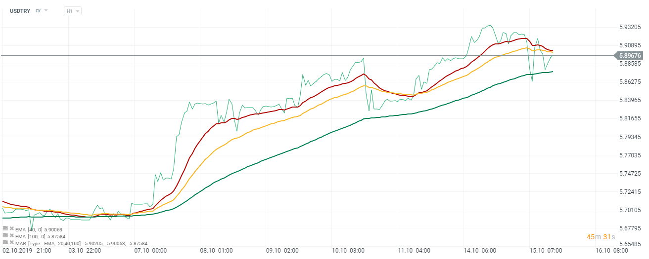
Line chart and moving average EMA. USD / TRY chart, H1 interval. Source: xNUMX XTB xStation
A line chart is the simplest, graphical representation of the price. It is easy to find a trend on it, but it is hard to find more detailed signals of reversal. I am well aware that these are extreme examples. Therefore, we will take the OHLC chart for the workshop, which carries as much information as candles.
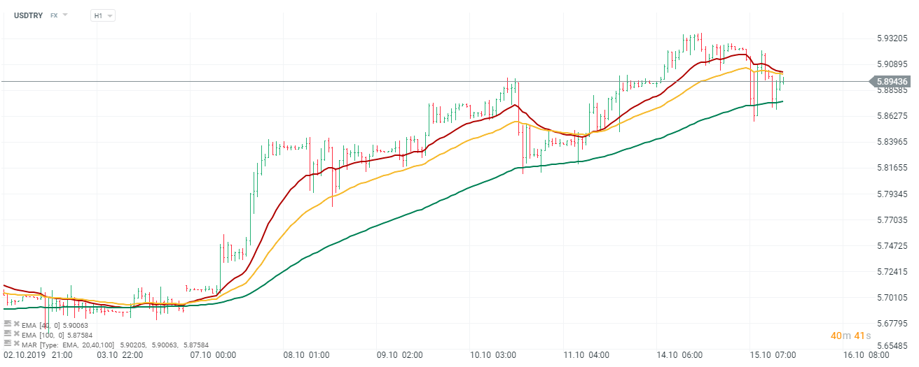
Bar chart (OHLC) and moving average EMA. USD / TRY chart, H1 interval. Source: xNUMX XTB xStation
In my opinion it is definitely less readable than filled candle bodies. It is harder to see moments of "pulling" bear or bullish movements.
Price action
Candlestick charts at the beginning of their "career" on the Old Continent appealed to traders analyzing a clean chart, and with the progress in the development of new strategies also those using price action method. To this day, an important and key aspect of their application has been not only readability and ease of reading signals. Price action tests price behavior at specific levels that have stopped around marked support / resistance in the past.
In places of support / resistance, all candle formations are considered as additional confirmation of the created movement. Formations so-called continuation. Among them, the most popular examples are three bull market or bear market, three white soldiers or three black crows.
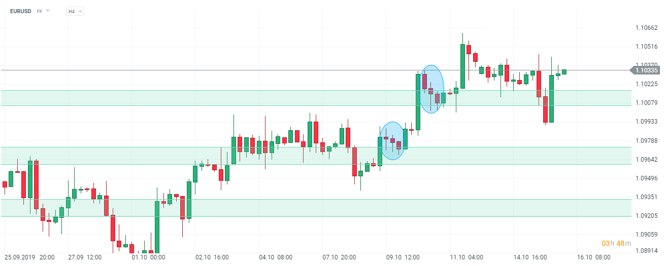
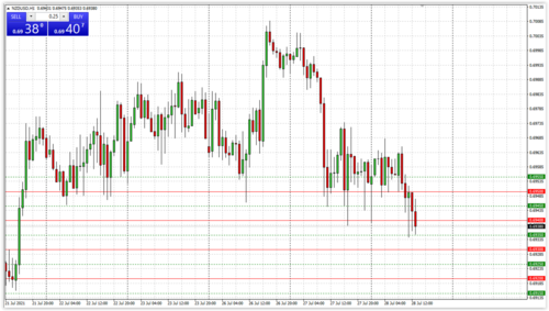
Price Action and candlestick chart. USD / TRY chart, H1 interval. Source: xNUMX XTB xStation
This is clearly seen in the graph above, where the resistance support zones are marked in green. In general, we could choose a strategy based on waiting for the breakout and testing of a given zone. However, knowing the basics of continuation formation, one can see two confirmations indicating a continuation of the demand movement. The places marked with the blue ellipse formed the three booms mentioned above. It is not difficult to imagine that we are looking for three candles after just showing it on the chart. They should have bearish undertones and be contained in a large growth candle.
Inside bars are also a popular formation - we presented a short strategy using them in TYM article. It is less often used in price action and is a separate, interesting investment concept mainly for trading on the D1 interval.
Volume and candlestick formations
I also met with strategies based on pure chart analyzes, where traders are looking for confirmations of a given volume. The so-called bobbin. What makes a candle a bobbin is only a small body, not the shape and size of the shadows. They occur in many formations (mainly inversions). By taking them to the workshop in terms of volume, traders often look for such bobbins that, on the occasion of their creation, were characterized by a large volume of trading, which increases their importance. More attractive signals are generated by hammers, falling candles or all kinds of hugs (bull market) if they have support in turnover.
Knowledge of the formation in terms of the conditions necessary for its formation is extremely important. In some candle arrangements, the color does not matter much, there may be both red and green bars, while in others it is a necessary condition. A reliable and correct signal is generated only by full formations, therefore pulling a few candles to create a "pseudo system" will not make much sense.


Leave a Response