


Types of charts

Do you know all types of charts? There are many of them, and each presents differently the behavior of the financial instrument course in the past. Some have a simpler structure and inform about the necessary minimum, others provide more data and give a more accurate view of how it shaped Dinner. Depending on the needs, the investor can choose the most convenient chart form for him, on which he will make his analyzes.
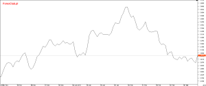
Line graph
Definitely the simplest type and probably also the most popular for this reason. Especially liked by beginners and "Sunday" investors who do not require too much data. The line chart only reports one price per period (usually the closing price).
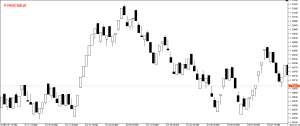
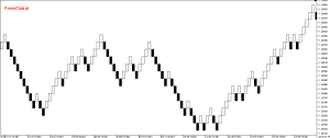
A bar graph
This type of chart already provides more information about the price behavior in a given period. The post (vertical line with the tab on the left and right side) has the so-called OHLC, that is the opening price (Open), maximum (High), minimum (Low) and the closing price (Close).
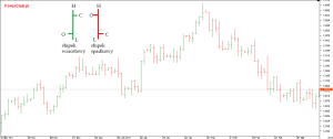
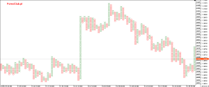
Chart candlestick
The candlestick chart is similar in construction to the bar. Its advantage is the entire set of candle formations that can be part of the strategy and provide signals for opening / closing positions or suggest continuation or reversal of the trend. It also provides data in the form of OHLC, where the maximum and minimum are determined by the so-called shadows (upper and lower), and the field between the opening and closing price is the candle's body.
READ NECESSARY: Wicks of candles - ways to play and use

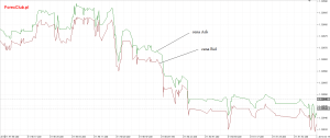
Tick chart
In a sense, this is a line chart, however, quite specific, thanks to which we can observe exactly how the price is shaped. Tick is nothing but a single price change (not always always by 1 point). The tick chart shows each price change in the form of a price jump. Usually Bid and Ask prices are displayed simultaneously (the difference between them is the size of the spread).
Range Bars chart
The Range Bars could literally be translated as post range. This type of charts is based on ticks, although it is displayed in the form of bars or candles. Their appearance is not determined by the time (chart interval) but by the range of movement in points generated by the price of the instrument. This means that in a Range Bars chart with a designated range of "5", each bar or candlestick will be 5 pips. Moving above this value opens another bar / candle. The chart is made on ticks, the prices that have actually occurred, so if the price of the instrument is not very smooth, there are gaps between the candlesticks in the chart.
Renko chart
This chart is very close to Range Bars with a few slight differences. It is also based on a given movement in points and time does not affect its form, however, the Renko chart is closed in "blocks" that are not based on ticks and connects even those prices that did not appear on the market. Thanks to this, the chart is "liquid" and there are no price gaps on it, as is the case with Range Bars.
READ ALSO: Renko charts - trading without time pressure
It can be displayed in two forms: Brig (does not include candle shadows) or wrick (takes into account the shadows of candles).
Spot-symbolic chart
A very specific and not very popular type of charts, mainly due to its unreadable form. It only reacts to significant market movements that are beyond a certain level. Low activity and minimal rate fluctuations are not included in the chart. Therefore, thanks to them, it is easy to locate significant levels in the market (support and resistance) as we see changes with more dynamic movements. The chart is based on two signs - "x" and "o". In a situation where an increase will be recorded on the instrument in a given time period, a column consisting of crosses is plotted. In the event of a drop, a column with circles appears.


I have never even included these symbolic points. as for me, black magic. someone knows someone who plays it…? 😀